Tuesday 17 December 2013

Construction: Day Ten


Today we worked on the ancillary tasks for our music video project which includes a digipak and and advertisement. We started with the digipak where we had to use Photoshop and measure out the dimensions that were needed for it to be the correct size of a real digipak. We then had to decide on photographs for the front cover (seen on the right) and for the song listings (seen in the middle). We made these choices because of the three girls lying on the floor looking upwards at where the songs are listed (in the clouds), however, we are still undecided at what is to go on the left of our first digipak. We then went on to decide on the typeface and the positioning of the text, this is important because the digipak must look as professional as possible. We downloaded several fonts from DaFont and used different fonts for the band name, album name and the song listings. We chose to do this because we want to make our digipak as 'un-static' as possible. We also thought that it was important that our song listings and album name were in clear, bold fonts that the potential audience would be able to read quickly and easily. 

Furthermore, we also want to incorporate the concept of our music video into our digipak and eventually our advertisement. This is focusing on bright and blocky colours that catch the audiences attention and reinforcing the unity of the girl band which is also important to our target audience (which is younger girls who see friendship as important). When completed, we want our digipak to be professional because it is important that the band that we have created would actually have potential within the music industry.

First Draft Music Video


Friday 13 December 2013

Construction: Day Nine


Today, our group decided to re-shoot the green screens that we are going to be using throughout the video as our performance shots. To do this we had to independently set up the green screens in our media classroom, thinking about the lighting, framing and the creases (which were an issue last time). We done all this in reply to our feedback which suggested that the shots in our first draft video were very 'static' and we should include more close ups. When actually filming, which we can see a photograph of Amie doing underneath, we had to ensure that our lip synching was in perfect timing even more than before, because of the fact that the shots are now close up. Furthermore, as we can also see below, there are various shadows behind Amie when we were filming which were due to the placement of the lights, however, after uploading our footage we discovered that these can easily eliminated on Premiere Pro when we add the block colours that we want using the Ultra Key and then playing around with the saturation of the frame.


Tuesday 10 December 2013

Construction: Day Eight


We have faced a number of technical issues when editing our music video. One of these issues has been with the green screens because there are visible creases in the background that have proven very difficult to remove. Our group tried using the Sixteen Point Garbage Matte, but it didn't work out well for our background, so we decided to remove the effect and go ahead with re-shooting our green-screen shots to get rid of creases in the background.


However, our group did use ProcAmp to modify the colour of the background for all of the clips. In Libby's green-screen, the creases in the background have gone, thanks to playing with the brightness, contrast and saturation of the ProcAmp effect. This is a more vibrant, brighter colour, that catches the viewers attention even more than before. It also adheres to our genre and links back to the concept that we had before we even starting filming, which was 'bright and blocky colours'.


As we can see above, there are visible creases and shadows in Maddie's shot (with the green background), but no visible creases in my shot (with the blue background) nor Amie's shot with the orange background.


These other clips look a lot more vibrant now than before, thanks to the ProcAmp effect, by playing around with the brightness, contrast and saturation. This manages to disguise the gloomy weather on a typical November afternoon in London. We chose to increase the vibrancy of these colours in particular because they are very conventional of the pop genre. We have incorporated this all into the narrative of the video which highlights the three girls having the perfect day.

Friday 6 December 2013

Construction: Day Seven


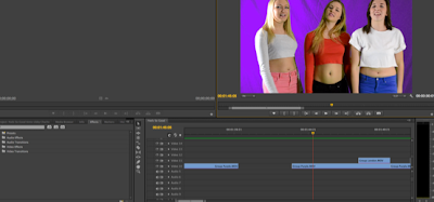
We have been continued to edit over the course of this week. We also completed our first draft and received feedback from our peers which allowed us to understand further what we need to do to improve. We decided that we didn't have a wide enough range of shot types. For example, you can see in the bottom photograph that we have continuous long shots running through the video and we can see in the top photograph that we also have enough mid shots, so we need to work on different angles and close ups. We also decided (after looking back on various conventional pop videos similar to the one that we are trying to create) that we do not cut our clips quick enough during the entire duration of the video (see Move by Little Mix below) so in order to work on this we have been cutting clips and moving them around, whilst ensuring that they are still in sync to make the video faster paced and more exciting. This is seen in the middle photograph above. Finally, we have also decided to include more narrative in our work. This will mean shooting more cutaways which will give the audience the opportunity to understand the girls individual personalities.