This is the questionnaire that our group created in order to distribute and find out the demographic of our audience. We managed to collectively receive 60 responses of various genders and ages. All of these people also had very different opinions on music and what they classify the pop genre to contain. The main purpose of this questionnaire however, was to discover what people thought would be a good pop music video, so we can take the information on board and then use it to create a music video that will be interesting and exciting for audiences to consume. Some examples of the questions that we asked were: 'What do you expect to see in a music video?' which is a very open question and 'How many music videos do you watch per week?' which is a closed question.
Showing posts with label Research. Show all posts
Monday, 23 September 2013
Tuesday, 17 September 2013
17. Audience Research 2
We decided to analyse half of our questionnaire results by rounding up the majority or the most popular result and filming ourselves saying them. This was easier and clearer than presenting it in a chart or graph. We discovered that through asking sixty people an open question, we got six results that were the most popular. For example, for the 'favourite pop artist' question the most popular answers were Jason Derulo, Justin Timberlake, Taylor Swift, One Direction, Miley Cyrus and Justin Bieber. We also discovered that the most popular way of watching music videos is through YouTube. I think filming half of the results instead of presenting them all in one way makes it more interesting and supervisual.
We analysed the remainder of the results using pie charts. We can clearly see the results and it is a quick way of consuming the information. We can see that exactly half of our audience preferred American pop music and the other half preferred English. We can also see that the answers are not biased according to gender because there were almost exactly half and half male and female responses. Furthermore, the majority of people that we asked were in the 16-24 age bracket which is the target audience that we are going to be aiming for when we create our music video of the pop genre.
These results were very beneficial for our group because based on our findings we were able to decide what we are going to include in our music video.Firstly, it will make more sense for our artist to come from Britain rather than America. We are also going to aim our video at a target audience of 16 to 24 year olds because the most positive and knowledgeable results came from this age group. We are also going to challenge ourselves and include all of what people expect to see in music videos that adhere to the pop genre. This will ensure our video will be as exciting and interesting as possible.
Through carrying out this research we discovered some specific features that we are going to include in our work. Some of these specifics are bright colours, a change in location, a change of costume, lip syncing, performing and dancing,. These are all things that are generally expected of a pop music video, therefore we will adhere to the conventions ourselves.
These results were very beneficial for our group because based on our findings we were able to decide what we are going to include in our music video.Firstly, it will make more sense for our artist to come from Britain rather than America. We are also going to aim our video at a target audience of 16 to 24 year olds because the most positive and knowledgeable results came from this age group. We are also going to challenge ourselves and include all of what people expect to see in music videos that adhere to the pop genre. This will ensure our video will be as exciting and interesting as possible.
Through carrying out this research we discovered some specific features that we are going to include in our work. Some of these specifics are bright colours, a change in location, a change of costume, lip syncing, performing and dancing,. These are all things that are generally expected of a pop music video, therefore we will adhere to the conventions ourselves.
Sunday, 15 September 2013
15. Advertisement Research
Mise en Scene
In the advert I can see a photograph of Katy Perry standing in outside in a garden. The sky is blue, the fence is perfectly white and their is a paddling pool behind her. Katy is dressed provocatively in bright colours (pink and purple) which connotate her being a stereotypical girl. The pink and white font also emphasises this. The advert also contains the name of the artist, the name of the album and when the album is being released which are all conventions of adverts.
Performance
Katy is standing tall and confident whilst looking directly into the camera, which suggests to us that she is a strong female figure within the music industry. The advert shows us her full body length and shows us that she has an athletic figure. Again, the setting of the advert suggests that Katy's album is going to be upbeat and energetic because it shows strong links to the Summer season.
Design
The piece of text that we are immediately drawn too on the advert is Katy Perry's name because it has been placed at the top in a large font in a bright colour. The name of the artist is a crucial convention when it comes to magazine adverts because even if the audience read nothing else, they will notice her name and she will therefore be more recognisable to a broader audience. The fact the font is in pink and white connotate the sterotypical female within the music indsutry.
Camerawork
The entire advert is a long shot. This is usually done so as much information as possible can be contained. For example, from just looking at the advert we can see that Katy is the artist and her album is being released on the 22nd September, we can also see that she is dressed according to the hot weather and the paddling pool suggests that she wants to make the most of the sunshine. Furthermore, the photograph has been taken using the Rule of Thirds so it seems natural for the audience to look at and is simple rather than abstract.
Mise en Scene
In the advert we can see Jessie J looking into the camera. The background has been kept simple and is just a plain white background which I think is because Jessie J's image is so bold that we are immediately drawn to her. Jessie is wearing black clothing, big hoop earrings, black nail varnish and even black lipstick. This makes the audience feel weary of Jessie because her appearance is quite threatening.
Performance
As I said before, Jessie is looking directly into the camera which highlights that she is confident and is a strong character. The advert only shows us the upper half of Jessie's body so we are able to get a closer view of her face and make up, Jessie J's appearance defines her and makes her unique as a pop artist.
Design
The use of the colours black and white are very simple but very effective. Because of the lack of colours everywhere else in the advert, we are immediately drawn to the gold font which connotates royalty, wealth and power. Furthermore, the name of the artist, the name of the album (Who You Are) and an image of the artist are all included on the advert which adhere to the conventions expected.
Camerawork
The advert is a close up of the artists face which allows us to feel as if we have a personal connection with the artist. This is especially important to Jessie J's fans because they want to feel connected to her because this will help them understand her better.
Mise en Scene
In the advert we can see six photographs of Olly Murs standing in different positions. Because the album being advertised is self titled (and it was his first album) it is important that Olly's fans begin to understand him as an artist. The use of the colour red isn't stereotypical for a male artist, but works well against the plain white background and makes the artists name stand out.
Performance
In some of the photos Olly is looking directly into the camera and in some he is looking away. This could be a representation of his personality and the songs on the album. We can tell from Olly's body language that he is confident and has a fun, lively personality and this is important because it will be reflected in his music.
Design
The use of the colours black and white are simple but effective and prove to be a popular choice for pop artists. The use of the colour red, however, is what draws the audience in. The name of the artist, name of the album and several photos of the artist have been used on the advert, adhering to the conventions that we expect of pop music album covers.
Camerawork
The photos that have been used of Olly are all long shots which allow us to view his body language and the clothes that he is wearing. As his career has developed over the recent years, Olly's bowler hat has become his trademark as an artist and it is how some audiences may recognise him, so it is important that this has been included right from the beginning. The fact that six different photographs have been used make the advert seem even and in balance which is important because pop isn't about abstraction.
Thursday, 12 September 2013
12. Genre Research 3: Conventions of Pop Music Video
There are various conventions of Pop Music Videos:
1. There is usually a link between the lyrics being sung, and the visuals that we see on screen.
2. There is usually a link between the editing and the visuals, like when a music video is cut to the beat of the song.
3. There is usually high key lighting and bright colours. This attracts attention and drags the audience in.
4. The costume in the video will be whatever is currently fashionable. This attracts a younger and stereotypically 'cooler' audience.
5. The artists in the video are usually young, this is so their audience can relate to them.
6. Most pop music videos contain a concept/narrative based on love.
7. There are often references to both the artist and the name of the song to remind the audience of what they are about.
8. The artist is often shown performing at at least one point during the video.
9. There are often close ups of the artists face in pop video, this is so the audience gets a real connection with the artist.
10. Artists sometimes feature a recurring motif in their videos which makes them recognisable. This could be an item of clothing or a physical feature.
11. Genre Research 2: Music Videos from the Pop Genre
The video opens showing us the band instrumentally playing the beginning of their song in a stereotypical band set up. They are based on the top of a building overlooking a city at either sunrise or sunset. The lighting is low key and we cannot see the bands faces immediately which makes them seem mysterious and interesting. The camerawork is very simple: a long shot and the editing is very slow paced at this point, however this could change at the video progresses.
As I guessed, the video progresses and the editing speeds up. We also begin to see a range of camera shots including, long shots, mid shots and close ups. This makes the video more aesthetically pleasing for the audience. Furthermore, the mise en scene develops in the video and the setting is revealed: a dark and dingy flat in a tower block, also we get to see how the band members are dressed, which is how I expected and adheres to the genre of alternative rock: dark skinny clothing and messy hair.
Location change is very conventional for any music video and this is what we begin to see here as the band members go from being in a bedroom into being in a bar. The cinematography in the video is very clever because it slides from shot to shot rather than cutting and because the band are in a domestic environment it seems as if we are 'looking through the keyhole' and getting an insight into their lives. The fact that the video flicks between being in black and white and in colour makes it more interesting for the audience.
As the video begins to draw to a close, we are shown for longer periods of time the band lip syncing, gesturing, dancing and playing their instruments. This gives the audience a clear idea about the band and their image/the genre they are trying to portray. The clothes that they wear when performing are either black or very dark colours and give connotations of sadness, betrayal and link with the lyrics they are singing about. Furthermore, this is the final position that we see the band in therefore it is made the most memorable and gives the clearest representation of alternative rock music.
This is the opening for the 'Pompeii' video by Bastille. We immediately see an extreme long shot of one of the band members standing on the top of a large wall or building. They are in the middle of what seems like it should be a busy place but he is standing and staring into space before the music even starts. After about 10 seconds, the video cuts to a close up of his face and the name of the song and band appear on screen. This is a very good way to remind the audience of the band and they are already begin to establish themselves before the song even starts.
As the music starts we begin to understand the narrative that is being portrayed. We see the man look over across into the city but he is in a derelict building, which emphasises the idea of being alone. The cinematography begins to vary from this point onwards and we see long shots, extreme long shots, over the shoulder shots and close ups. Furthermore, we also notice that the editing isn't as fast paced as, for example, a pop music video and this could be because of the speed of the song and the more laid back mood that it has.
It is a bit unusual that everywhere this man goes is empty when he is visiting places that are usually filled with people. This conveys a eerie and scary mood. However, we begin to understand why is in such a panic to get away from all these places (which we are able to tell from the fast paced editing) when we see the two women look up at him in the arcade. The fact that the women are alive but it seems like they are not actually within their bodies could be a reflection of the lyric: 'If you close your eyes, does it almost feel like nothing changed at all'.
Location change is vital in order to make a music video both gripping and interesting and this video manages to show this brilliantly. However, what makes it even better is that they decide to flick between day and night to show how threatening the location looks at night and how normal it looks during the day. The costume that the man is wearing is very simple and doesn't draw any immediate attention, which adheres to the genre of video that has been created.
According to Goodwin's theory, Charlie Brown by Coldplay would be an illustration video because there isn't actually a clear concept or narrative that runs through to create meaning. However, something we do notice is the extreme close ups of actions being made by the people in the video (such as opening windows and putting on shoes) alongside the immediate fast paced editing which lets us know the song is going to be upbeat and the video exciting for the audience to watch. This video matches very well to the Mylo Xyloto album cover where this song originated from.
45 seconds into the video is when the artist appears for the first time, this could have been confusing for the audience. Furthermore, the mise en scene is always gripping and interesting because of the setting of the music video (which is a nightclub, full of people and colour) which is consistently cross cut between a concept that we are not yet aware of as the audience. Unusually, the lyrics are not the main focus for the video and it is more about the music behind the lyrics which is constantly made to be the main focus.
This part of the video is very important for the audience because it is what it has been building up too. We wonder as the audience where the girl with the curly hair is heading for the first two minutes of the video and when it is finally revealed it is as if the audience can relax and be at ease with the situation. Furthermore, the setting for the video is not exactly conventional of the genre but it works really well. Again, the costume that the band and characters are wearing do not draw immediate attention, but still manage to show their personalities. Finally, I think it is a good representation of an alternative rock music video.
14. Record Label Research
Island Records:
History: Island Records is a record label that was founded by Chris Blackwell and Graeme Goodall in Jamaica. It was based in the United Kingdom for many years and is now owned by Universal Music Group. The company relocated to the UK in May 1962. Graeme Goodall left to start Doctor Bird (another record label) in 1965. Until Blackwell sold the label to PolyGram in 1989, Island was the largest indie record label in history. Island had a major influence on the progressive music scene of the UK in the early 1970s.Artists: Jessie J, Amy Winehouse, Stevie Wonder, The Wanted, Disclosure and McFly.
Promotional material: Island Records uses various promotional advertisement materials to ensure their consistent success, this is even more important since they have grown in size and media publicity over the last decade.
Location: Kensington High Street (London) and New York (America).
Division: Island Def Jam Music Group.
Year established: 1959
Parent company: Universal Music.
Island Records would be a good choice for my artist because they are a well established and popular record label that musicians aspire to be signed too. Because Island Records are not specific to genre, a pop artist would be good for them to broaden their horizons and they would definitely do well being signed to Island Records.
XL Recordings:
History: XL Recordings is a British independent record label owned by Richard Russell. It originated as a 1989 offshoot of Beggars Banquet Records. The label was released in 1989 mainly to work with rave, dance and rock music.
Artists: Adele, The XX, Friendly Fires, Radiohead, Jack Penate and Vampire Weekend.
Promotional material: As they are an independent label they do not really feel the need to advertise, however they have become more well-known due to the success of Adele which has led to widespread publication in the media. Adele is their most well known and successful artist to this date.
Location: They have bases in both London and New York.
Year established: 1989
Parent company: Independent.
XL Recordings would be a good choice of record label for my artist because they are independent, which means they know that they have to work hard to get artists out there and correctly publicised. Furthermore, XL Recordings have had dealings with Adele, one of the most successful pop artists in the world.
Syco Entertainment:
History: Syco Entertainment is a joint venture between Simon Cowell and Sony Music. It does not only focus on music, but television, film and digital content. Cowell and Sony each own 50% of the business. Syco Entertainment is primarily operate in the United Kingdom and feeds from artists off of The X Factor and Got Talent, which are two of the largest television formats in the world. Key people behind Syco are Simon Cowell, Charles Garland and Nigel Hall.
Artists: Olly Murs, JLS, One Direction, Cher Lloyd and Labrinth.
Promotional material: As the majority of their artists are already well known when they are signed because of either The X Factor or Got Talent. Syco choose to promote their artists when their careers have developed and people need to be reminded of the material that they are releasing.
Location: They are mainly based in London but have bases in Los Angeles as well.
Year established: 2002
Parent company: Sony
Syco Entertainment would be a good choice of record label for my artist because most of their artists work revolve around the pop genre therefore they are experts on target audiences and what makes an artist individual yet successful.
10. Genre Research 1: Mood Board
These are two different mood boards that my group put together that show our interpretations of pop music. The first mood board shows pop artists that people wouldn't necessarily associate with pop such as Panic! At The Disco, Coldplay and Ellie Goulding. The second mood board, however shows us artists that we would immediately associate with pop such as Katy Perry, Justin Bieber and Taylor Swift. The second mood board is more relevant to our chosen genre and is what we are going to focus on because the conventions will be easier to follow. Some specific conventions of the pop genre that we are going to follow in our own pop music video are cutting to the beat, looking into the camera, using bright colours and most important of all, making sure that our video is exciting, upbeat and consistently interesting throughout.
Tuesday, 10 September 2013
13. CD Cover Research (Pop)
The generic features of all CD covers are:
- The name of the album
- The name of the artist/band
- A photograph of the artist/band
- A bar code
- A spine (which also often has the name of the artist and album again)
These are some individual analysis' that I done of Coldplay: 'Mylo Xyloto, The Wanted 'Battleground' and The Fray 'Scars and Stories' and their album covers:
Monday, 9 September 2013
9. Theory Two- Andrew Goodwin: Dancing in the Distraction Factory (1992)
Andrew Goodwin had a theory that pop music videos were either one of three possible types. Illustration, amplification or disjuncture.
Illustration:
Music: Always cut on the beat.
Lyrics: Images illustrate the literal meaning or feelings of the lyrics, often the band sings and dances.
Image: The band will often sing, dance, play instruments and wear costume that is expected of them.
For example: The Way (Ariana Grande ft. Mac Miller):
Amplification:
Music: Film cuts on the beat but also off to emphasise specific features.
Lyrics: Images amplify the lyrics, a specific narrative may be used that wouldn't be picked up from the lyrics only.
Image: The band will probably take on fictional roles/characters that adhere to the concept or narrative.
For example: Last Friday Night (Katy Perry):
Disjuncture:
Music: Film cuts off the beat. Sometimes the sign of a bad music video.
Lyrics: Images which do not relate to the lyrics used, this is sometimes used by bands who are well established and can afford to take risks within their work.
Image: An image that is completely unrelated is taken on by the band/artist.
For example: Da Funk (Daft Punk):
Illustration:
Music: Always cut on the beat.
Lyrics: Images illustrate the literal meaning or feelings of the lyrics, often the band sings and dances.
Image: The band will often sing, dance, play instruments and wear costume that is expected of them.
For example: The Way (Ariana Grande ft. Mac Miller):
- The artist sings (lip syncs), gestures and dances during the video
- The video is cut to the beat.
- The artists are dressed just as we expect them to be dressed.
Amplification:
Music: Film cuts on the beat but also off to emphasise specific features.
Lyrics: Images amplify the lyrics, a specific narrative may be used that wouldn't be picked up from the lyrics only.
Image: The band will probably take on fictional roles/characters that adhere to the concept or narrative.
For example: Last Friday Night (Katy Perry):
- Fictional characters are taken on in the video
- The actions in the video amplify the lyrics that they are lip syncing too.
- The concept/narrative that runs through could be interpreted in different ways.
Disjuncture:
Music: Film cuts off the beat. Sometimes the sign of a bad music video.
Lyrics: Images which do not relate to the lyrics used, this is sometimes used by bands who are well established and can afford to take risks within their work.
Image: An image that is completely unrelated is taken on by the band/artist.
For example: Da Funk (Daft Punk):
- The video is not cut to the beat.
- The artists do not appear in the video (and if they do, this is not made clear).
- There is only dialogue throughout the video, no singing or lip syncing.
8. Theory One- Carol Vernallis: The Kindest Cut (Function and Meaning in Music Video Editing)
Vernallis analysed editing in music video and Hollywood Film and the differences between them.
Music Videos:
- The concepts/narrative intertwine and obscure paths.
- The order of the shots is unconventional. They shift more freely and there is no 'typical order'.
- Time, space and character are revealed completely.
- Discontinuity: Pop video usually draws us away from the narrative by foregrounding other structures.
- Visual hooks create continuity. Non-continuous shots are linked by a single feature, unified by shape, setting, colour, etc.
- Sometimes all visual hooks are equal but sometimes one is dominant.
- There is a clear narrative running throughout.
- The order of the shots is conventional. There is a typical order and at times you can predict what is going to happen.
- Time, space and character aren't always immediately revealed.
- Continuity: Hollywood Film usually draws into the narrative.
- Sometimes all visual hooks are equal but sometimes one is dominant.
Saturday, 31 August 2013
7. Imogen Heap: A-Ha! Analysis
This video follows the actions of a girl participating in a number of strange events. The video opens with a long shot of the young girl crouching down in what appears to be the middle of a forest. As the music begins to play her head flicks up as if she is an animal. We automatically notice that the colour is all in black and white, although the black is dominant which gives us connotations of fear and death. We subconsciously worry about the young girl being alone in the forest because stereotypical representations indicate that females are the 'weaker' gender. Furthermore, the editing is VERY fast paced and no shot is on screen for longer than a second during the entire video, this make us feel nervous and on edge.
This wind up jewellery box appears in different stages throughout the video and connotates young innocence. The fact that the box has been wound up but is now alone on the floor seems creepy and makes us wonder what is going on and why it has been left there. The fact that this is a close up is also mysterious because we cannot see any surroundings. Again, we do not have much time to wonder because of the fast paced editing which means it has soon been cut on to something else. The idea of 'fairy tales' in music videos are quite rare but very effective because there is a very thin line between childhood innocence and danger.
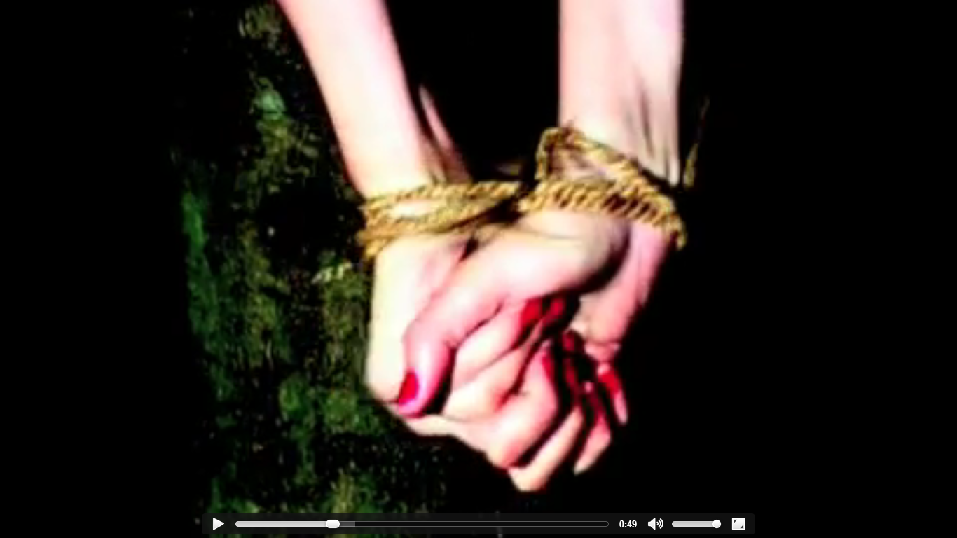
The first glimpse of colour we get in the video is this shot which is of a females pair of hands tied together. The way the hands are clenched together suggest the woman is in pain and her red fingernails connotate danger. The lighting is consistently low key throughout the video which conveys a sinister tone to the audience. Throughout the video, only small amounts of colour are shown which teases the audience because they do not have enough knowledge to fully figure out what is happening as it is hard to see through the black and white mise en scene of the video.
The cinematography in this video is very varied, however, the main shot type that is used throughout is the extreme close up. Again, a small amount of colour has been used in this shot but the deep red alongside the pale skin allows us to associate with evil. However, it could also connotate love or lust. The fact that we cannot see the woman's face is ambiguous and continues to hide the narrative from the audience.
When we finally get to see the performer in the video her face is disfigured and she does not look directly at the camera (which is conventional of music videos). The way that she gestures and performs however, is stereotypical of a female within a music video. The way in which she performs changes throughout the video from her dancing, singing (or lip syncing) and playing the piano. Furthermore, we do not expect any good to come of the narrative because everything seems too dark and dangerous. The main themes in this video are fear, disaster and destruction.
7. The Fix: Just Got Paid Analysis
The fade in from black and then the white strobe lights appearing one by one on screen is very simple yet very effective. The strobe lighting idea is also connotated with pop music videos and reminds me of JLS's 'One Shot'. Furthermore, unusually for a 'low budget' music video we are automatically given connotations of wealth and money (which is relevant to the title and lyrics of the song), this is because of the setting which seems like a modern, airy, bright household with lots of expensive decor. The boys costume which consist of suits, shirts and ties also convey messages of wealth. Not only that, but the way the band are introduced when they are each individually looking at themselves in the mirror suggests to us that the boys are vain and confident, as most people with money stereotypically are.
The simple choreography in this section of the video informs us of the lead singer (who is placed at the front middle of the arrangement), it also connotates the concept and the genre of the video which is a stereotypical, young and immature boy band who are looking for their chance to make it in the music industry. Furthermore, the editing in this section of the video is very fast paced and to follow the conventions of all music videos, no shot is on screen for longer than three seconds otherwise this could become very boring for the audience. The cinematography in the video isn't very varied and we seem to be consistently seeing either close ups or long shots such as the boys faces or them dancing.
In this section of the video we are focused on the 'less important' members of the band, we get this impression because they haven't been made as dominant in the rest of the video. We get a strong feeling of domesticity in this section because of the way the boys are sitting on the stairs and acting comfortable as if they are in their home environment, this would help appeal to their target audience of young/teenage girls because they look laid back but confident at the same time. Not only that, but we notice that the boys always stare directly into the camera which would also make the audience feel more involved in their performance and it also seems more personal.
The way the video starts and ends with all five boys together reinforces the idea of them being in a band and having a close friendship. This is shown here. Also, the frequent costume and location changes that we see thoughout the video are very conventional and many pop music videos in the music industry follow them as these students have. Finally, the fade to black at the end is built up to by the volume and speed of the song decreasing, this is something that seems natural to us and works particularly well after the boys all drop to the floor at the end of the song.
Friday, 23 August 2013
5. Green Day: Boulevard of Broken Dreams Analysis (Rock 2)
I have chosen to analyse 'Boulevard of Broken Dreams' by Green Day because I think the video is very conventional of the rock genre. Firstly, it is a promotional video for the band because although it doesn't convey a particular message, it reminds everyone of what the band is about, what kind of audience they are targeting and the personalities of the members. The band are lip syncing which is conventional of all music videos.
The mise en scene in the video consists of an exotic, rural location which is derelict and abandoned, at times, the lyrics within the song actually match the location with the use of the words 'empty' and 'broken'. The costume which the band are wearing (dark suits with white suits and dark ties) match the solemn and pitiful mood that the music video emits, because they give connotations of death and funerals. The scratchiness that we view on screen at the beginning of the video is also very serious and could also make some people feel weary of the band because they could be viewed as dangerous. Also, the fire that we see towards the end of the video gives connotations of danger and abandonment. Unusually, there is high key lighting throughout the video.
The performance that the band gives throughout the video is consistent, but we really begin to understand the feelings and messages behind the song when they are performing in the set up environment and using their instruments. The fact that none of the band members smile throughout the video is expected from this particular genre, however if we were watching a pop music video, the situation would be very different.
Furthermore, the editing in the video is not very fast and on average each shot is on screen from two to three seconds which may not seem like long, but can become boring for the audience in some situations. However, even though the editing is slow, it suits the pace of the song. Each shot has also been cut to the beat of the music which make the editing seem less jumpy and more natural for the viewer.
The cinematography is very varied throughout the video. It starts off flicking between close ups (of the band members faces) and long shots (which shows the audience the location), however, as the narrative in the song and therefore the video develops, shots become more varied and we see lots of mid shots and even some low angle shots when the band are performing. We also see close ups of specific objects throughout the video, such as right at the beginning when there are various close ups of the 'green' car that 'Green Day' step out of and then abandon prior to their performance.
I like this video because even though the narrative has been kept simple, it is very conventional of its genre and shows consistent performance and meaningful mise en scene.
The mise en scene in the video consists of an exotic, rural location which is derelict and abandoned, at times, the lyrics within the song actually match the location with the use of the words 'empty' and 'broken'. The costume which the band are wearing (dark suits with white suits and dark ties) match the solemn and pitiful mood that the music video emits, because they give connotations of death and funerals. The scratchiness that we view on screen at the beginning of the video is also very serious and could also make some people feel weary of the band because they could be viewed as dangerous. Also, the fire that we see towards the end of the video gives connotations of danger and abandonment. Unusually, there is high key lighting throughout the video.
The performance that the band gives throughout the video is consistent, but we really begin to understand the feelings and messages behind the song when they are performing in the set up environment and using their instruments. The fact that none of the band members smile throughout the video is expected from this particular genre, however if we were watching a pop music video, the situation would be very different.
Furthermore, the editing in the video is not very fast and on average each shot is on screen from two to three seconds which may not seem like long, but can become boring for the audience in some situations. However, even though the editing is slow, it suits the pace of the song. Each shot has also been cut to the beat of the music which make the editing seem less jumpy and more natural for the viewer.
The cinematography is very varied throughout the video. It starts off flicking between close ups (of the band members faces) and long shots (which shows the audience the location), however, as the narrative in the song and therefore the video develops, shots become more varied and we see lots of mid shots and even some low angle shots when the band are performing. We also see close ups of specific objects throughout the video, such as right at the beginning when there are various close ups of the 'green' car that 'Green Day' step out of and then abandon prior to their performance.
I like this video because even though the narrative has been kept simple, it is very conventional of its genre and shows consistent performance and meaningful mise en scene.
Thursday, 22 August 2013
Thursday, 11 July 2013
2. The Wanted: Glad You Came Analysis (Pop 1)
The pop music video that I am
going to be analysing is ‘Glad You Came’ by The Wanted. The music video was
released in July 2011 and the single was number one in the UK for 2 weeks. I
have chosen to analyse this video for a variety of reasons. Firstly, the video
is very conventional of the pop genre, which is generally what the band’s songs
adhere to, it consists of the band in Ibiza, Spain partying and having a good
time in the hot weather. The ‘feel-good’ and ‘party’ mood that we get from the
music video alongside the upbeat song that goes with it is what I feel promoted
the single and along with the fact that is was released in the summer, the
timing couldn’t have been better in order for the single’s success.
Also, the music video has a
variety of long shots, mid shots and close ups throughout that have all been put
together using a montage edit. There are individual close ups of each member at
the beginning of the video which allows the audience to feel like they know the
band personally. After this it immediately cuts away to random shots of the
Ibiza nightlife which seems to be clubs, beaches and lots of girls. The bands
performance is important after this because they begin to sing, the way in
which they perform is also very conventional of not only their genre, but what
we expect from boy bands which includes gazing into the camera, dancing around
in the party shots and yet again, just generally having a good time.
The editing is very fast paced
throughout the whole music video and each cut is done to the beat of the song.
This makes the video seem more natural to watch and the fast paced element
makes it exciting and intriguing for the audience.
Furthermore, the location for the
music video is also important. As I said before, the video was filmed in Ibiza
which is not only the perfect place for a party; it is also an exotic location
which is what any good music video needs in order to be exciting and
mysterious. This is shown in the mise en scene of the video, but especially
towards the middle during the pool party when there is lots of close ups of the
band and the editing is as fast as ever so it seems as if there is something
being hidden.
Another thing that I noticed whilst watching the music video is that it cuts between night and day and at both points the boys in the band are still having as much fun as they possibly can. In some ways, this is promoting Ibiza as a holiday resort because people watching may be thinking how they would like to have a holiday just like that. However, the video is most importantly promotional of the band and the message that they are trying to convey which seems to be enjoying the music and themselves.
I think the way in which the video is 'wrapped up' is very effective because it goes back to the band sitting on a cliff and singing in two staggered lines. This makes the entire video feel as if it has been a day out in the sun and gives the concept of the video a proper meaning, this is very effective for the audience.
Tuesday, 9 July 2013
Subscribe to:
Posts (Atom)